Salaam: Building a Brand Identity
Salaam creates mutual understanding between Muslims and non-Muslims. They are a non-religious, non-partisan organization that brings people together to overcome fear.
As a new organization, Salaam needed a comprehensive visual brand identity. After working with Nathan.works to develop core messaging elements (mission/vision statements and organizational summary), Salaam asked us to create the organization’s visual brand identity from the ground up.

The Salaam brand presented a number of challenges.
We had to avoid making Salaam appear too Islamic.
As an organization dedicated to combating Islamophobia, Salaam obviously holds Islam in high respect, and its board is comprised of both progressive Muslims and non-Muslims. However, Salaam is decidedly not a Muslim organization. It is religiously unaffiliated, focused narrowly on the creation of peace and understanding. This makes Salaam almost unique in its competitive landscape – most similar organizations promote Islam.
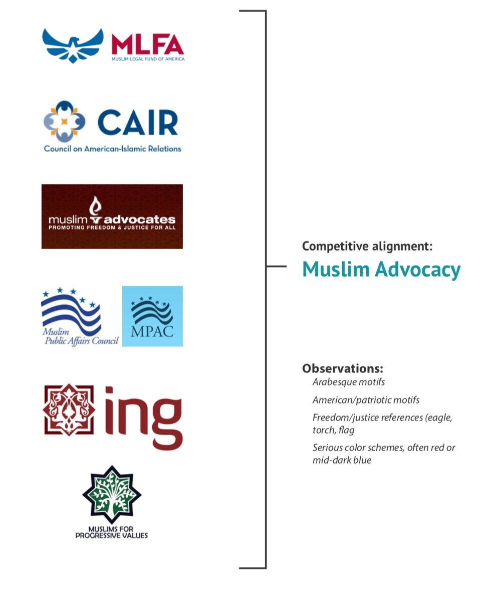
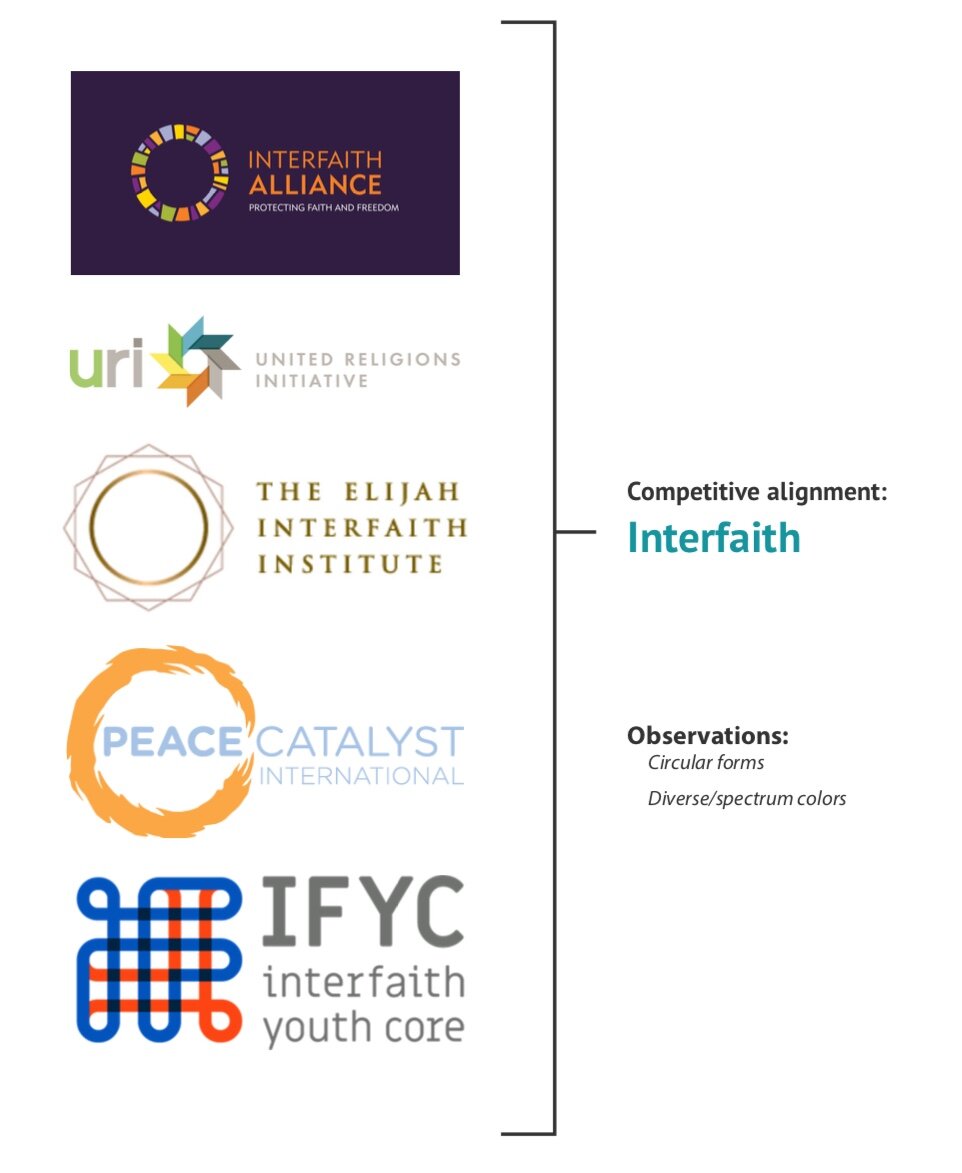
Competitive landscape
Our research revealed several themes among logos in Salaam’s space.
Organizations that advocate for Muslims tend to be patriotic and Arabesque…
…while interfaith groups lean toward circles…
…and peace groups are replete with doves and blue.

All of this presented some fairly obvious and familiar motifs to use in logo construction.

Initial concepts, however, either pushed Salaam too far into the “peace” camp or else evoked Islam too strongly.
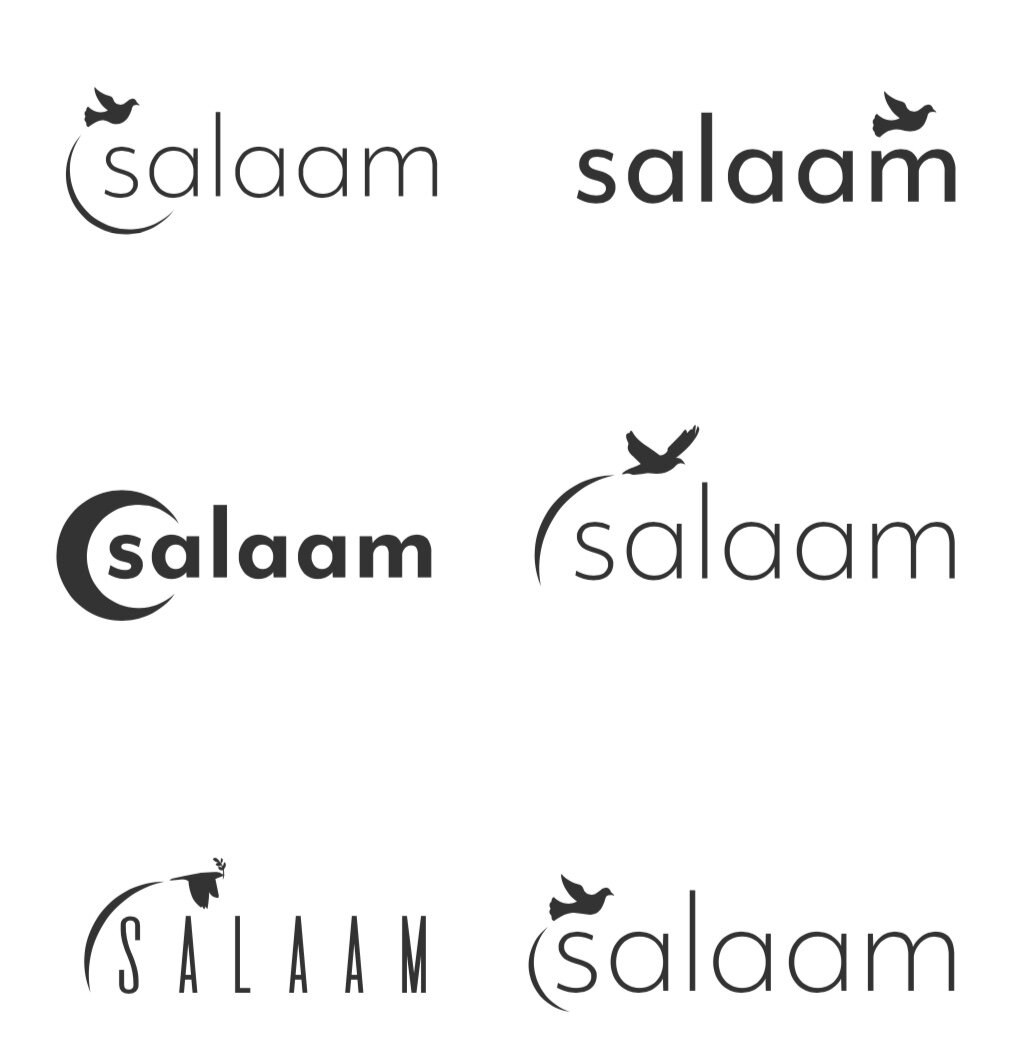
In the end, we chose to pursue an abstraction of the familiar crescent motif.

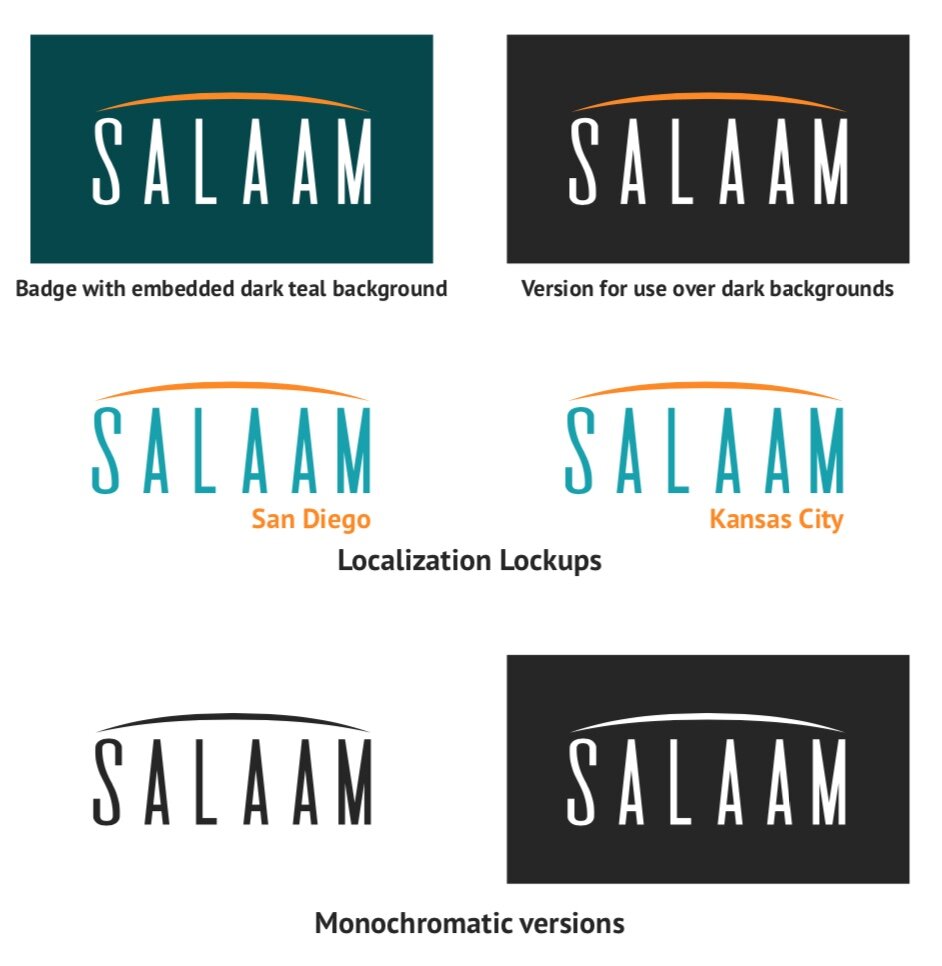
The Salaam logo is a teal wordmark of the organization’s name with a wide orange crescent stretching over it.
The crescent is an abstraction of the Islamic crescent. It has been rotated, widened, and thinned to span the width of the wordmark. In this form, it subtly evokes the religion that is at the center of Salaam’s advocacy and educational initiatives, but it is also a bridge spanning the gulf between Muslims and non-Muslims. Finally, it rests in a shape and color that calls to mind a rising sun or a horizon: a dawning future of mutual understanding and peace.
Logo Construction

The Salaam logo is constructed using multiples of a unit, defined as a square equal in width to the vertical strokes of the letterforms. This unit is used to proportion the logo’s height (17 units), width (42 units), and other internal measurements.
The S letterform follows common typography practice in slightly exceeding the bounds of its allotted quadrangle; thus, the logo’s width measurement is taken from end to end of the crescent. Likewise, as the S slightly descends slightly below the baseline, the height measurement is taken from the bottom of the M.
The optional localization lockups will vary in width but must be placed two units from the baseline of the wordmark.
Typeface
The wordmark is set in a customized typeface, modified from De Valencia by Manuel Fernández del Campo García. Originally designed for the titles of Mexican independent film A Solas, De Valencia’s letterforms stand tall and thin like people.
Our wordmark’s characters have been compressed from their original height while retaining their sense of an upright human form. The kerning stands them apart far enough to remain individuals with distinct identities, but they are connected both in their equitable monospacing and their position under the unifying arch.
Color Palette

The Salaam color palette was chosen to evoke a bridge over water, seen at dawn.
